Jaguar New Logo Analysis: Genius or “Bud Light” Disaster?
Deconstructing the “Copy Nothing” campaign, the Type 00 GT, and the most controversial automotive rebrand of the decade.
Expert Analysis by JustOborn Editorial | Updated: December 2025
It began with a video of models in brightly colored futuristic fashion, and ended with Elon Musk tweeting, “Do you sell cars?” The launch of the Jaguar New Logo and the accompanying “Copy Nothing” campaign has ignited a cultural firestorm not seen in branding since the “New Coke” debacle.
However, beneath the social media outrage lies a calculated, high-stakes business gamble. Jaguar is attempting to execute a “Firebreak”—intentionally burning down its recent history of mid-tier luxury sedans to be reborn as an ultra-luxury electric rival to Bentley. In this expert review analysis, we strip away the noise to evaluate the design merit, business logic, and future viability of the new Jaguar.
The “Firebreak” Strategy: Burning the Past
To understand why Jaguar deleted all its Instagram posts and released an ad with no cars, we must look at the financials. For the last decade, Jaguar tried—and failed—to be a high-volume competitor to BMW and Audi. It diluted the brand.
The new strategy, led by JLR’s Chief Creative Officer Gerry McGovern, is based on a quote by founder Sir William Lyons: “A Jaguar should be a copy of nothing.”
The strategy is simple but brutal: Stop selling cars for a year. Let the inventory dry up. Create scarcity. Then, relaunch at a price point double the previous average ($130,000+). This requires a visual identity that signals a complete break from the “old” Jaguar.
Related: See how Founder Stories shape modern corporate pivots.
The Type 00 Concept: The physical manifestation of the rebrand.
The “Copy Nothing” Controversy
The rebrand launched with a 30-second spot featuring diverse models in “Exuberant” colors (Pink, Yellow, Red) breaking through screens. The backlash was instant. Traditionalists accused the brand of “going woke” and forgetting its automotive roots.
🧠 Expert Insight
The outrage was likely a calculated feature, not a bug. In the attention economy, anger drives engagement. By triggering a “culture war” debate, Jaguar generated millions of dollars in earned media. They aren’t trying to sell cars to the people complaining on Twitter; they are signaling to the fashion-forward elite in Miami and Dubai.
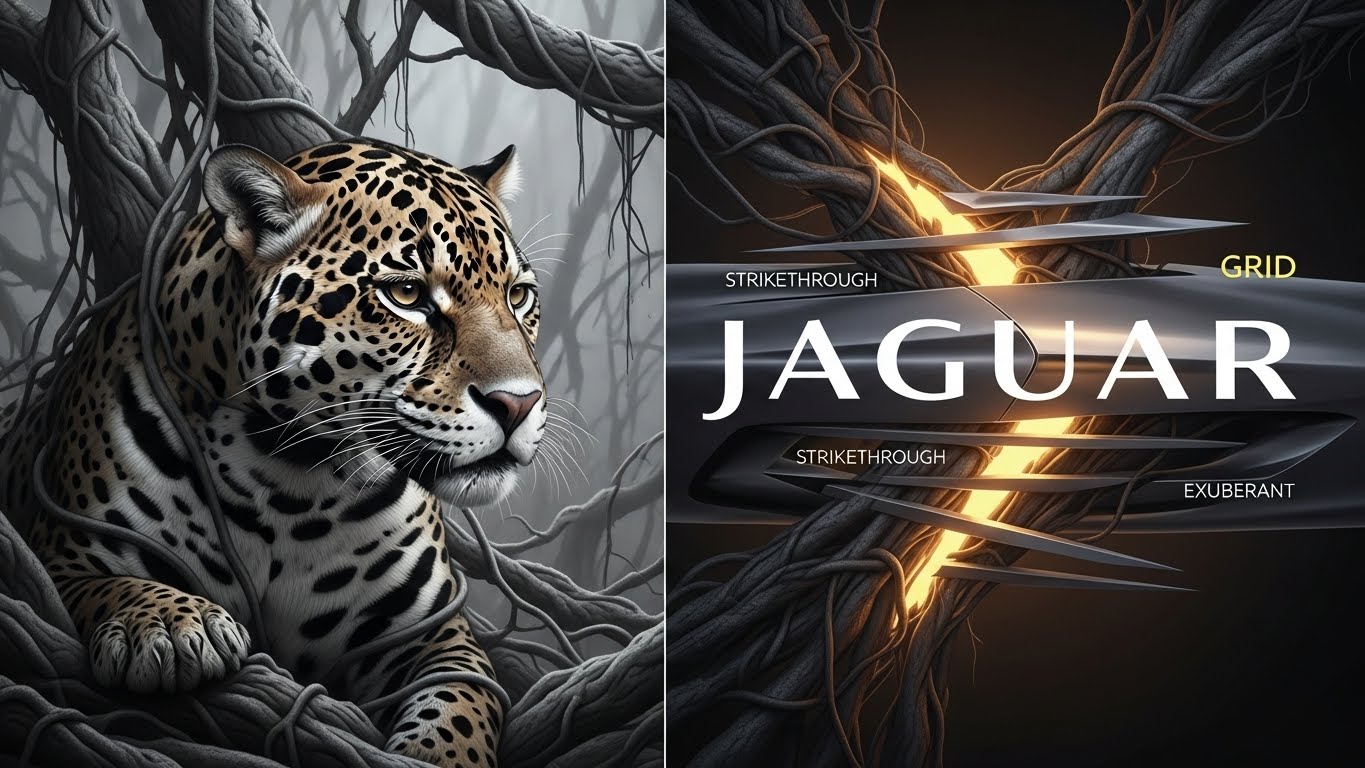
Deconstructing the “Exuberant” Identity
The rebrand consists of four key visual elements. Let’s review them technically:
| Element | Analysis | Design Verdict |
|---|---|---|
| The Device (Strikethrough) | A linear graphic of horizontal bars. Represents breaking boundaries. | Weakness: Confusing. Looks like a printing error or a redacted document. |
| The Typography (JaGUar) | A custom geometric font mixing upper and lowercase (G and U are caps). | Strength: Unique, symmetrical, and perfectly balanced. Highly recognizable. |
| The Maker’s Mark | A roundel containing the ‘j’ and ‘r’. Replaces the Leaper on the hood. | Neutral: Elegant, fits jewelry/fashion aesthetics, but lacks automotive aggression. |
| The Palette | Exuberant Yellow, Red, and Pink. No British Racing Green. | Bold: Successfully separates the brand from traditional “Old Money” aesthetics. |
The famous “Leaper” (the jumping cat) is not dead, but it has been demoted. It will appear as a subtle watermark or on chips, but no longer as the primary badge. This is similar to how luxury fashion houses modernize their monograms.
The Type 00: When the Rubber Hits the Road
The controversy quieted slightly when Jaguar revealed the Type 00 Concept at Miami Art Week. This electric GT is the first physical proof of the new direction.
- Design: A “boat tail” rear, incredibly long hood (despite having no engine), and squared-off, brutalist lines.
- Price Point: Targeting the £100,000+ market, competing with the Porsche Taycan and Bentley Continental.
- The Tech: Promised 430-mile range and rapid charging.
For the UHNWI (Ultra-High-Net-Worth Individual), the Type 00 offers something Tesla does not: narrative exclusivity and art-deco styling.
🎬 Multimedia Analysis
To understand the tonal shift, view the comparison between the marketing and the reality.
Analysis: The viral moment that sparked the backlash.
Analysis: A closer look at the Type 00 concept car lines.
Final Expert Verdict
Risky, But Necessary.
Is the Jaguar New Logo a disaster? In the short term, socially, yes. But strategically, it is brilliant. Jaguar was slowly dying a quiet death. Now, the whole world is talking about it.
The design work is technically proficient, even if the “Strikethrough” is confusing. By pivoting to ultra-luxury, Jaguar is saving itself from the commoditization of the premium EV market. If the production cars drive as good as the Type 00 looks, the “Copy Nothing” campaign will be studied in marketing classes for decades.
Leave a Reply